

Brand Strategy and Packaging Graphics: Making a Consumer Connection
A brand is the visual, emotional, rational, and cultural image and experience that you associate with a company or a product. Brands are built from the consumer up and are the result of many decisions about a product’s features, positioning, pricing, promotions, and packaging. Brands are brought to life through graphic design, which can include logos, colors, and typefaces. This paper explains how to think about brand strategy overall and how packaging graphic design can be used to improve a brand’s resonance with consumers.
By: Berlin Packaging Specialist
Date: October 28, 2019
A brand is the visual, emotional, rational, and cultural image and experience that you associate with a company or a product. When you hear of Nike, you probably think “Just Do It.” When you smell a pretzel in a mall, you might think Auntie Anne’s. The fact that you quickly associate a slogan or smell with a brand makes your connection with that brand stronger. Importantly, it also makes product selection easier and enhances the value and satisfaction you get from the product or service.
Some brands are so strong that they are transcendent – they become synonymous with a category. McDonalds is all about burgers and fries; Budweiser is the King of Beers. McDonalds and Budweiser are so successful because they have invested in many elements that come together into a strong brand. Packaging is an important element of how brands get created and embraced.
Our white paper, Designing a Winning Package Structure: A Process for Delivering Delight, describes how to build a package structure that works with consumers, retailers, your brand, and your financial targets.
In this paper, we turn to how to wrap that package structure with the right graphics. Graphic design includes colors, logos, typefaces (and much more), all of which have the opportunity to bring more meaning to a package and, therefore, a brand. Graphic design can be used to distinguish a brand among a sea of competitors and create a tighter relationship with the consumer.
Indeed, successful companies build their brands using visual cues. When you see these logos, you start to make immediate associations.
But graphic design can’t be done in a vacuum. This paper explains how to think about your brand strategy overall and how graphic design can be used to improve your brand’s resonance with consumers. We will address four questions:
- How healthy is your brand?
- What are the considerations in designing and redesigning a brand?
- What is in the branding and graphic-design toolbox?
- How should the creative process for packaging graphics be structured?
Before getting into how well your brand is faring, we first turn to what a brand really is.
Branding Basics
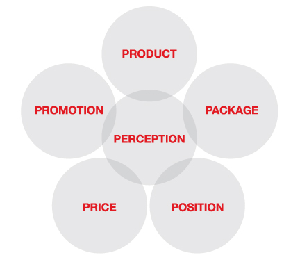
The American Marketing Association narrowly defines a brand as a “name, term, design, symbol, or any other feature that identifies one seller’s good or service as distinct from those of other sellers. A brand may identify one item, a family of items, or all items of that seller.” We assert a brand is more than a name or symbol; there are many elements that make up a brand. We use the “Six P” model, which is shown here. A brand is the culmination of:
- Product: What the consumer is looking to get; the formula and key ingredients.
- Package: What the product is contained in, which includes the structure, the brand identity, and the graphic communication hierarchy.
- Position: How the offering is differentiated from the competition; the key elements for consumers to appreciate and the supporting “reasons to believe.”
- Price: How much the offering costs consumers.
- Promotion: How the offering is presented in the market to attract consumers; special offers, displays, and bundling are all examples of ways to drive trial and repeat.
- Perception: How the other five “Ps”’ are interpreted by the consumer; this is what the consumer ultimately experiences and represents what the brand means to them.
In this paper, we focus primarily on packaging graphics, which are embedded in the Package element. Graphic design, when handled in concert with the other branding elements, can play a powerful role in how consumers notice, engage, and experience a brand. Tazo Tea provides one example.
Case Study: Tazo Tea

Tazo is one brand at the forefront of this upswell. Tazo was founded in 1994 and was inspired by the coffee culture trend emerging in the US with the ascent of Starbucks. Part of Tazo’s success was the strong brand identity and transformative packaging that harks back to the origins and heritage of the tea trade. Key branding elements used by Tazo include:
- A brand mark inspired by ancient alchemical symbolism.
- An evocative tagline – “The reincarnation of tea.”
- A muted color palette recalling aged tea chests.
- Typographic styles synonymous with antique manuscripts.
- Distressed textures to infer aging and ancient origins.
- An authenticity achieved with influences from high-end spirits packaging (seals and cigar bands).
When combined with the aroma of tea, the overall packaging is powerful. Consumers have responded well, and millions of cups of tea are brewed with Tazo leaves.
In 2013, Starbucks, which now owns Tazo, changed Tazo’s packaging and positioning to be more contemporary and sleek. Time will tell if they are making the right moves with a brand that distinguished itself with its packaging.
Brand Health
A successful, healthy brand must capture the hearts and wallets of consumers. A brand must be:
- Relevant – consumers must see it addressing a need or desire they have.
- Deliverable – the company must have a means to follow through on the brand’s promises.
- Credible – the company behind the promise has to be believable.
- Differentiated – it must possess qualities that cause it to stand apart from other brands.
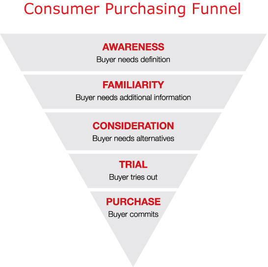
Doing well against these dimensions will propel consumers through the consumer purchasing funnel. Brands that fire on all cylinders – relevant, deliverable, credible, and differentiated – are able to cut through the clutter and attract attention, engender familiarity and consideration, and motivate shoppers to try the product.
Conversely, if a brand is failing on any of these dimensions, it’s time to return to the drawing board and think of ways to revitalize the brand.
Indicators that a brand is unhealthy include declines in critical metrics:
- Facings – retailers are allocating space to other brands.
- Sales velocity per facing – fewer consumers are pulling the product off the shelf.
- Brand equity scores – consumers are not hearing, understanding, or appreciating the brand’s positioning.
- Pricing – unpromoted prices are declining and promotions are becoming more necessary to move volume.
- Loyal consumers – competitors are winning with your core audience.
Brands can be recharged by refocusing on the fundamentals and the “six Ps” discussed earlier. Target is an excellent example of rebranding success. In twenty years, the company went from being a tired, second-rate discounter to a leading-edge, contemporary retailer that partners with the likes of Neiman Marcus.
The same transformative story can occur in the world of packaged goods if approached properly.
Considerations for Brand Design and Redesign
Building a brand is a complex process involving many disciplines, tremendous research and insight, and creative flair. While we cannot synthesize this entire process here, we can highlight some of the key considerations and decisions that must be addressed in creating a brand. We will cover four areas:
- consumer dynamics,
- category dynamics,
- positioning statement, and
- portfolio connectivity.
Each of these areas is important, and each helps inform how graphic design and identity can communicate key themes and messages to consumers.
Consumer Dynamics
Who are the consumers and what are they looking for?
The foundation of every brand is the relationship it has with its current and prospective consumers. There are many lenses through which to view the consumer; these lenses yield data that must be digested and prioritized. Lenses include:
- Demographics – how consumers look. This covers many variables, including gender, race, age, abilities/disabilities, home ownership, employment and marital status, and even location. Examples of demographic trends are the greater number of single-person households and the aging of the population. But, ultimately, what someone looks like or where they live is too superficial to dictate most important branding decisions.
- Attitudes and beliefs – what consumers value and think. An attitude is a consumer’s evaluation of something; it synthesizes cognitive thoughts, emotions, and lessons learned from real experiences. A belief gets more to the core of a person’s psyche; beliefs are the spiritual, moral, and social foundation on which people operate. Attitudes and beliefs impact how people perceive and interact with the world around them, so they are important to building brands. Indeed, Gatorade ended their endorsement deal with Tiger Woods in 2010 because public attitudes toward him changed after disclosure of his indiscretions, potentially damaging their brand.
- Behaviors – what consumers do. Consumers ultimately vote with their wallets. Assessing which customers are choosing, embracing, and recommending a brand (and the psychology of why) is very powerful. Knowing why other consumers are disengaged is often equally important.
Diving into the consumer is the first important element of designing or redesigning a brand. Even at this high level, packaging graphics can enter the conversation. If a product is oriented to consumers aged 13-17, for example, the branding can be bolder and more colorful than a product designed for seniors. With a thorough understanding of consumers and what motivates them, we can turn to decisions about how to appeal to these consumers.
| Category norms |
|---|
|
|
| Method's products |
|
|
Category Dynamics
How closely will you follow the category “rules”?
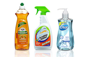
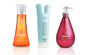
Every brand operates within a set of category conventions. You may choose to hew closely to the category norms (meaning you’re not rocking the boat; you won’t make a dramatic splash with consumers, but you also limit the risk of alienating them). Or you may choose to explode the category norms and stand out from the competition (a higher risk, higher return strategy). Consider the home care market. This category has well-known brands that follow a standard “language” and design ethic. When Method Products entered the market in 2000, they wanted to disrupt the status quo. They wanted their brand to stand out, so they livened up the fragrances and functionality. In addition, they built packaging that consumers didn’t have to hide under their sinks. As shown here, the Method lineup looks very different from that of its competitors. Breaking some of the category’s rules paid off for Method with over $100 million in sales and distribution in leading retailers.
Positioning Statement
What is the essence of the brand?
A positioning statement summarizes what a brand is all about. It is a succinct description of the core target audience to whom a brand is directed and a compelling picture of how the marketer wants that audience to view the brand. A well-constructed positioning statement brings focus and clarity to the development of marketing strategy and tactics. Every decision that is made regarding the brand should be judged by how well it supports the positioning statement.
There are four classic elements of a positioning statement.
- Target audience – the attitudinal and demographic description of the core prospect to whom the brand is intended to appeal; the group of customers that most closely represents the brand’s fervent users.
- Frame of reference – the category in which the brand competes; the context that gives the brand relevance to the customer.
- Benefit and point of difference – the most compelling and motivating benefit that the brand can own in the hearts and minds of its target audience relative to the competition.
- Reason to believe – the most convincing proof that the brand delivers what it promises.
To be useful, a positioning statement must be focused on the core prospect, relevant, ownable, and believable.
Portfolio Connectivity
How will the brand create connectivity across segments and categories?
Mrs. Meyers cleaning products is a good example of simple branding that creates unity across a broad product line.
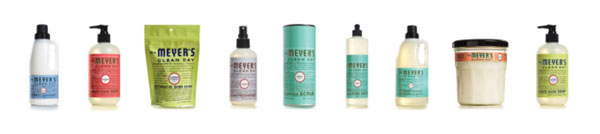
Mrs. Meyers has dozens of items across multiple segments, and the company has built a unified brand architecture with:
- Simple, stock packaging that connotes familiarity, comfort, and apothecary origins.
- Black caps and dispensing systems across all products.
- Standard use of the Mrs. Meyers logotype, with playful use of other fonts for the supporting text.
- Pastel colors.
- Natural scents like basil, lavender, geranium, and apple.
Note that Mrs. Meyers has succeeded alongside Method, which, as described earlier, took a different path. Both companies staked out unique positionings with distinct customer groups, and both were able to create a unified portfolio with a thoughtful use of the branding tools.
Many decisions go into building a brand. And there are different ways that graphic design can play a part.
Branding and Graphic-Design Toolbox
There is a wide array of graphic-identity tools and techniques. Smartly and consistently using these tools can dramatically enhance how consumers perceive a brand.
Some examples of the key tools include:
| Logo or Symbol | ||
|---|---|---|
 | An effective logo is a recognizable, distinctive symbol for a company or organization. It can be just an image or can include the name of the company. | |
| Color | ||
| Loud primary colors, such as red, attract attention (e.g., Budweiser). Neon connotes edginess (e.g., Mountain Dew), and blue often refers to purity (e.g., Nivea). | ||
| Typography | ||
| Typography is about arranging letters. Brand-builders select or create the right fonts and word styles to make the desired impression. | ||
| Shape | ||
 | White space (void) can make a design breathe and easier to understand. The FedEx logo, for example, cleverly creates an “arrow” shape in the “Ex”, which connotes speed and movement. | |
| Photography and Illustration | ||
 | Brands use imagery to connote feelings and emotions. Tiffany uses photography to capture romance and love in their brand story. | |
| Texture and More | ||
 | Design can move beyond two dimensions. Texture, aroma, music – all can be used to create the consumer brand experience. |
All of these tools – and more – need to be applied with the right balance, emphasis, and style. Graphic design is both an art and a science. If you have a computer, then you have access to software that can create graphics. But it’s a mistake to bypass expert help. You don’t need to hire an expensive branding consultancy; take advantage of your company’s internal resources, inexpensive freelancers, or other supply chain partners to get professional input on this important driver of branding.
Spotlight on Studio One Eleven
 Studio One Eleven is the design and marketing services division of Berlin Packaging, a leading supplier of rigid packaging. Studio One Eleven has deep experience in brand strategy, visual branding, and structural packaging design for customers across virtually every industry.
Studio One Eleven helps its customers build and redesign their brands. Branding services include:
- Brand positioning: Establishing the personality and identifying the target demographic for the brand.
- Category analysis: Researching the category/industry including an audit of competing brands.
- Brand identity design: Developing the brandmark that will appear on the packaging and all marketing, advertising, and corporate communications.
- Label design and architecture: Creating the label and communication hierarchy. Portfolio segmentation strategy: Building a cohesive system enabling consumers to shop a portfolio of products, thus enabling growth and opportunities for line extensions.
- Production artwork: Setting final art files for print production.
- Brand asset management: Organizing the imagery and assets associated with the packaging. These include artwork updates, communication and hierarchal changes, and product claim updates.
What sets Studio One Eleven apart from other design firms is the lack of large design fees. Customers get the benefit of a world-class team of designers, strategists, and engineers in exchange for purchasing the packaging solution through Berlin Packaging. Because Studio One Eleven is rewarded when Berlin Packaging sells packages, the Studio only pursues design that will win in the market.
The result is a powerful, self-reinforcing design system – with aligned incentives, an end-to-end process, and demonstrated results.
Creative Process for Packaging Graphics
While graphic design is about creative thinking, the process to create or update a brand’s graphic identity is fairly linear. As outlined in our white paper about structural design, Designing a Winning Package Structure: A Process for Delivering Delight, we advocate a six-phase approach.
Phase 0 – Pre-Design Analysis
This first phase is about research, understanding, and goals. Key elements include a complete situation assessment of the target brand’s positioning and equity, its history, its category, its competitors, and the channels it competes in. Designers want to learn about who the target consumer is, the way they interact with the product, and the attributes to which they assign value. No design work happens in this stage. Instead, the foundation on which design can occur is established. In addition, Phase 0’s output includes success criteria against which Phase 1 ideas will be judged.
Phase 1 – Ideation
Pen hits paper in Phase 1. Taking all the insights learned in Phase 0, this step is about exploring creative ideas. Solutions in this phase reach into the graphic-design toolbox and address brand marks, letterforms, and colors. Divergent thinking is the rule of the day in this phase of the process.
Phases 2 and 3 – Evaluation and Refinement
Here the solutions generated in Phase 1 pass through the success criteria “filter” developed in Phase 0. The Evaluation phase applies a reality check and forces tradeoffs against the goals. To ensure an efficient subsequent process, it’s critical that all stakeholders have a chance to weigh in at this stage. The Refinement phase then takes the best ideas and incorporates any feedback and constraints into the solutions. These two phases are quite iterative, and the output is an agreed-to design that will support the brand.
Phases 4 and 5 – Preparation and Production
In Phase 4, a design moves to an implementation-ready stage. Print-ready artwork is created; brand- and graphic-management systems are put in place to handle artwork files and revisions; and documents defining the “standards” are written. Then in Phase 5, the product is moved into production. Press checks and color matching will also happen here.
All through this, the cooperation between design and production must be very tight. Project management is an essential skill throughout the six phases, but it is mandatory at this stage. All the work that’s been put into the design is coming down the home stretch.
Even though the product is now sitting on store shelves, the design process is not over. Designers now listen closely to all key constituents. How is the printing and labeling going? What are retailers saying? Are consumers engaging? Even when a package is in production, enhancements and tweaks can be made to maximize impact and efficiency. Graphic elements are more easily changed than a package’s structure, so it’s smart to look first at graphic elements before more rigid elements of a brand’s identity are revised.
The overall goal of these six phases is to build packaging graphics that resonate with the brand’s goals and fit into the commercial realities of the business and the supply chain.
Getting Started
 As shown in the process above, building a resonant brand requires lots of thought and energy. But the journey can begin by thinking clearly about what your brand means and possible tactics for how it can best come to life.
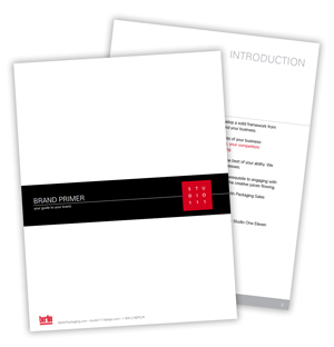
One tool that can help is Berlin Packaging’s Brand Primer. This document, which is available at BerlinPackaging.com/Brand-Primer, asks a series of basic but important questions that will be helpful in launching a new brand or a redesign of a current brand.
The Primer poses questions such as:
- What is the brand’s value proposition?
- What are the strengths and weaknesses of the brand?
- Who is the brand aimed at?
- If your brand were an automobile, which one would it be?
- What are the most identifiable parts of the brand’s identity?
- How is the product merchandised?
- What are exciting things the competition is doing?
While filling out the Primer is an iterative process, even draft answers to these questions help focus your thinking about your brand. Such a document also helps facilitate discussions with other partners like ad agencies and design firms.
Summary
Brands help both consumers and businesses. A good brand simplifies the shopping experience by integrating many features and factors into one bundle. It engenders strong emotional connections with products, driving consumer loyalty. And strong brands can generate tremendous value – according to BrandZ, the top 100 global brands were worth more than $330 billion in 2012. Building a compelling brand that resonates with consumers requires careful attention to the product’s features, positioning, pricing, promotions, and packaging, taking factors such as consumer and category dynamics, positioning statements, and portfolio thinking into consideration. Graphic design – both on a package and through other marketing channels – plays an important role in making a brand come to life. A logo is not a brand, but a logo – along with the right illustrations, fonts, colors, and textures – can elevate a brand to a new level. The marketplace is always evolving, so brands need to evolve as well. A smart first step is to evaluate your brand’s current performance or new white spaces to enter. At that point, you can form strategies and tactics to enliven your brand, including the best ways to use the graphic-design toolbox.
Learn more about Studio One Eleven
Visit the Studio's website, studio111design.com, or speak to a Berlin Packaging consultant by calling 800.2.BERLIN.